
Narrivelle
Footer
Build global footer links, newsletter, legal, and utility controls.
Header and footer
Finish the storefront with useful global content
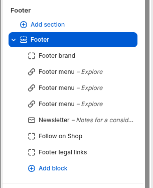
Open Customize → Footer → Footer. This guide covers only the group-level layout and utility controls; see Footer blocks for the fixed block positions and individual block settings.
Settings reference
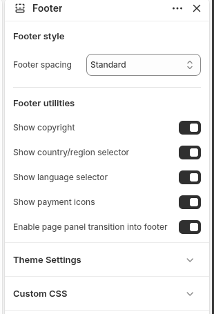
Use this reference while working in the Theme Editor. Setting names match the Narrivelle controls.
| Theme Editor setting | What it controls | Use and review |
|---|---|---|
| Footer spacing | Chooses Compact, Standard, or Spacious footer vertical rhythm. | Use spacing that supports the fixed footer layout without crowding or excessive empty space. |
| Show copyright | Shows the footer copyright line. | Review the storefront output and keep legal information current. |
| Show country selector / Show language selector | Shows Shopify localization controls when store configuration supports them. | Test only with configured markets and languages; controls may be unavailable when Shopify has no eligible data. |
| Show payment icons | Shows payment icons made available by Shopify. | Do not promise a payment method just because an icon is shown; checkout eligibility remains Shopify-controlled. |
| Enable footer panel transition | Enables the desktop footer-panel transition treatment. | Review the effect with reduced motion and ensure the footer remains fully usable without the transition. |