
Narrivelle
Editorial hero
Create the leading image-led campaign for the Home page.
Home page
Build a clear, image-led first impression
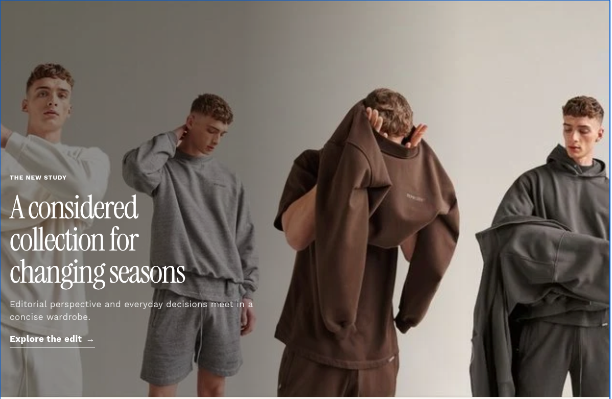
Open Customize → Home page → Editorial hero. This section is enabled only for the Home page and layers campaign copy over one responsive image treatment.
Start with a real destination
Choose the destination before styling the hero. The call to action appears only when both its label and link are set, so use a short action label and a real collection, product, or page destination.
Prepare the two image crops
Desktop image fills the hero at larger widths. Mobile image replaces it below the compact breakpoint when supplied. Use the same story in both crops, keep the main subject clear of the copy area, and add meaningful alt text in Shopify Files.
Make copy readable over media
Text protection adds a directional dark overlay behind the copy; its direction follows the selected text position. Pair it with a text color that has reliable contrast on the chosen image. Do not rely on the image alone to communicate the campaign.
Review responsive composition
Text position offers top, center, and bottom placement across left, center, and right. Text alignment is separate. Desktop and mobile heights use viewport-height ranges, while compact layouts move the overlay protection toward the bottom. Preview both images and all copy at compact and desktop widths.
Settings reference
Use this reference while working in the Theme Editor. Setting names match the Narrivelle controls.
| Theme Editor setting | What it controls | Use and review |
|---|---|---|
| Image | Sets the primary desktop hero image, which fills the image area with object-fit cover. | Use a high-quality wide image. Keep the focal subject away from the planned copy position and set accurate image alt text in Shopify Files. |
| Mobile image | Replaces the desktop image on compact screens when selected. | Use a deliberate portrait or compact crop of the same campaign. If left empty, the desktop image is used at every width. |
| Text protection | Sets the strength of the dark directional overlay behind the hero copy, from 0% to 90%. | Increase only until copy is clearly readable. Review light and dark image areas, and do not use overlay strength to conceal unsuitable imagery. |
| Eyebrow / Heading / Text | Creates the small label, primary campaign headline, and supporting rich text. | Keep the heading concise and make the supporting text useful on its own. Test a long heading and a missing optional eyebrow. |
| Heading size / Content width | Chooses Small, Medium, or Large heading scale and Narrow, Medium, or Wide copy measure. | Use wider content only when the image has enough quiet space. Check wrapping at desktop and compact widths. |
| Link label / Link | Creates the underlined hero call to action only when both fields have values. | Use an action-led label and a real destination. Test keyboard focus and make sure the destination fulfills the promise of the campaign. |
| Content position / Text alignment | Places the copy at one of nine top, center, or bottom positions and sets the text alignment independently. | Position copy over the quietest portion of the selected image. Center alignment can be used with side positions, but should be checked visually. |
| Desktop hero height / Mobile hero height | Sets the hero minimum height from 50vh to 100vh independently for desktop and compact displays. | Choose the shortest height that preserves the story. Test common laptop screens and a real phone so the next section is not pushed too far below the fold. |
| Text color | Sets the color used by the eyebrow, headline, body copy, and hero call to action. | Verify contrast against both desktop and mobile images together with Text protection. White is the default, not a guarantee of accessibility. |