
Narrivelle
Multi-column Highlights
Present up to three image- or icon-led details in a focused grid.
Home page
Explain the details that help customers decide
Open Customize → Home page → Add section → Multi-column Highlights. The section is also available on standard pages, but this guide covers its use on the Home page.
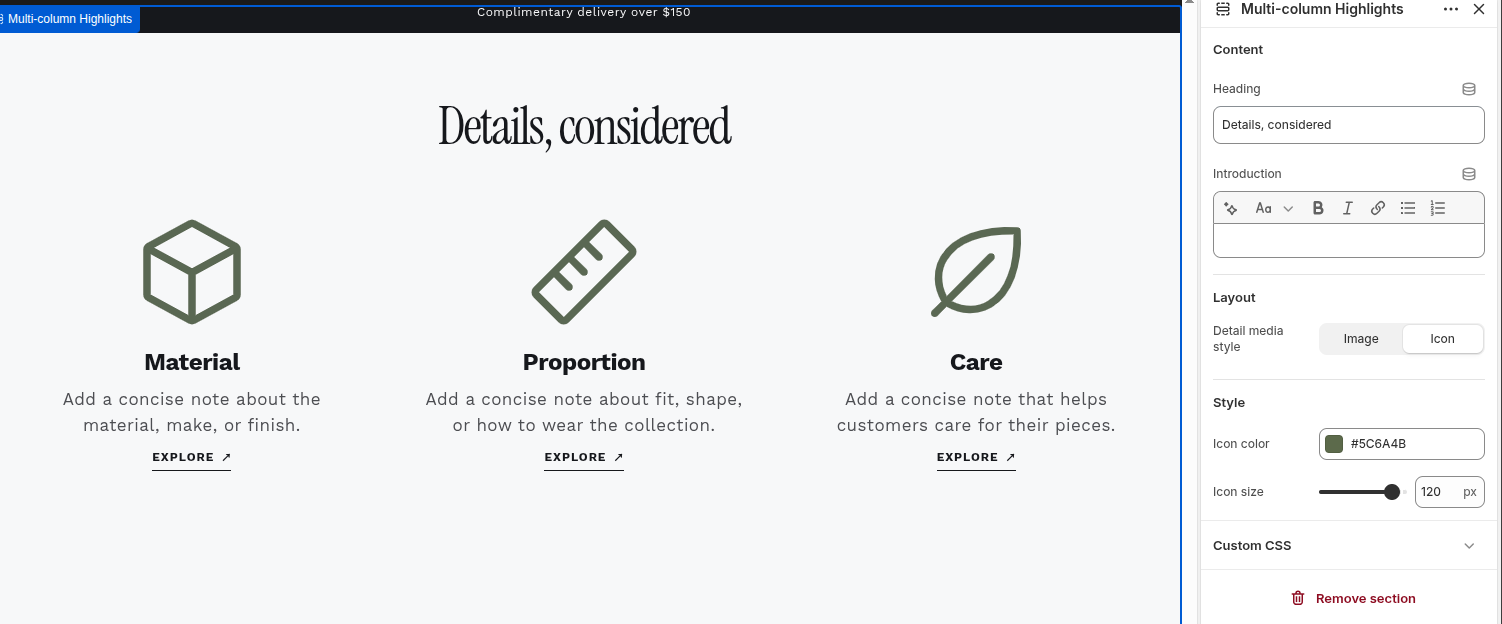
Use it for three distinct decisions
The section accepts a maximum of three Highlight blocks and becomes a three-column grid from tablet width upward. Use it for genuinely distinct topics such as material, proportion, care, delivery, or returns—not a long list of similar claims.
Choose one media system
Media style applies to the whole section. Image style reveals an image picker in each Highlight block and a shared image ratio. Icon style reveals an icon picker in each block plus shared icon color and size. Do not mix image and icon expectations within one section.
Make each block self-contained
A Highlight block can have media, heading, rich text, and an optional call to action. A call to action is rendered only when both the label and link are present. Keep the heading useful without the image or icon, and ensure each link has a clear destination.
Review the grid at every width
The layout stacks into one column on compact screens and uses three equal columns from tablet width. Check image cropping, icon scale, long headings, long rich text, keyboard focus, and any external or policy destination before publishing.
Settings reference
Use this reference while working in the Theme Editor. Setting names match the Narrivelle controls.
| Theme Editor setting | What it controls | Use and review |
|---|---|---|
| Heading / Intro | Creates the centered section heading and optional introductory rich text. | Use the intro to frame the three points, not to repeat them. Check wrapping with a long heading. |
| Media style | Chooses Image or Icon media for every Highlight block in the section. | Choose image for visual proof or icon for compact service and product attributes. Changing this control changes which block and style controls are visible. |
| Image ratio | Sets one shared crop ratio for all block images: Square, Portrait, Tall, Landscape, or Wide. | Available only for Image media style. Use one intentional ratio and verify every selected image still retains its important subject. |
| Icon color / Icon size | Sets the shared color and 48px–128px size for all block icons. | Available only for Icon media style. Maintain contrast with the section background and avoid oversized icons that displace the explanatory copy. |
Highlight block reference
Add no more than three Highlight blocks. Their order controls the left-to-right desktop reading order and the top-to-bottom compact reading order.
Highlight block — Image
Displays the selected image when the section Media style is Image.
- Settings
- Image; Heading; Text; Link label; Link.
- Review
- The image picker is visible only in Image style. Set descriptive alt text on the selected Shopify image and check its crop at the section-wide Image ratio.
Highlight block — Icon
Displays one selected theme icon when the section Media style is Icon.
- Settings
- Icon; Heading; Text; Link label; Link.
- Review
- The icon picker is visible only in Icon style. Narrivelle groups the available icons by shopping and payments, shipping and delivery, communication, trust and quality, and craft and editorial.
Highlight block — Content and CTA
Every block uses the same content controls regardless of its selected media style.
- Settings
- Heading; Text; Link label; Link.
- Review
- The block displays only when it has a heading. A CTA displays only when both Link label and Link have values; use a concise, honest label and a real destination.