
Narrivelle
Buttons and fields
Set global CTA and form-control appearance.
Theme settings
Keep actions and forms clear
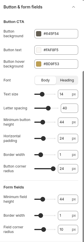
Open Theme settings → Buttons. The same area includes controls for buttons and standard form fields used throughout the theme.
Settings reference
Use this reference while working in the Theme Editor. Setting names match the Narrivelle controls.
| Theme Editor setting | What it controls | Use and review |
|---|---|---|
| Button CTA: colors | Sets button background, text, and hover background. | Check contrast in default, hover, focus, and disabled contexts. |
| Button CTA: font, text size, letter spacing, height, padding | Sets button typography and physical size. | Test long labels and touch targets at Compact width. |
| Button CTA: border width / Corner radius | Sets button outline and corner geometry. | Use values that match field geometry and the overall brand system. |
| Form fields: Field height / Border width / Corner radius | Sets baseline form-control dimensions. | Review search, newsletter, contact, quantity, cart note, keyboard focus, and errors. |