
Narrivelle
Product cards
Set global product-card media, badge, and text behaviour.
Theme settings
Make product grids useful before customers hover
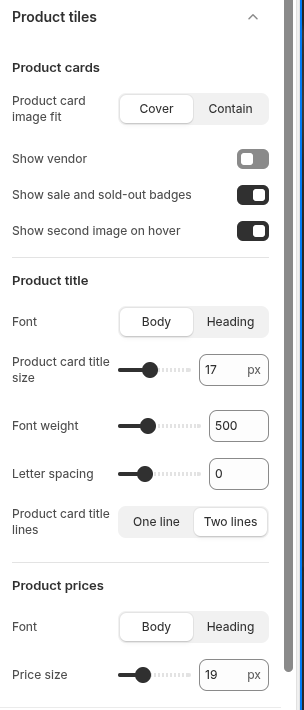
Open Theme settings → Product cards. The global settings combine with section-level product grid controls across collection, search, and merchandising surfaces.
Media fit
Use Cover for a consistent editorial crop or Contain when every edge of a product must remain visible. Review products with transparent backgrounds, different aspect ratios, and no image.
Information and badges
Choose whether product cards show vendor, sale/sold-out badges, and a second image on hover. A card must still communicate the product clearly without hover, so never depend on the second image or badge alone.
Title and price hierarchy
Control product title font, size, weight, letter spacing, and one- or two-line clamp, plus price font and size. Test long titles, compare-at prices, sale prices, and narrow grid columns.
Settings reference
Use this reference while working in the Theme Editor. Setting names match the Narrivelle controls.
| Theme Editor setting | What it controls | Use and review |
|---|---|---|
| Product card media fit | Chooses Cover or Contain image-fit behaviour. | Review portrait, landscape, transparent-background, and missing product images. |
| Show vendor / Show product badges / Show second image | Controls supporting information, sale and sold-out badges, and hover media. | Keep the card understandable without hover; verify badge contrast and keyboard access. |
| Product card font / title size / weight / letter spacing / title lines | Controls product-name hierarchy and line clamp. | Test the longest catalog title in every supported grid density. |
| Price font / Price size | Sets product-price typography. | Review sale, compare-at, and regular price combinations. |